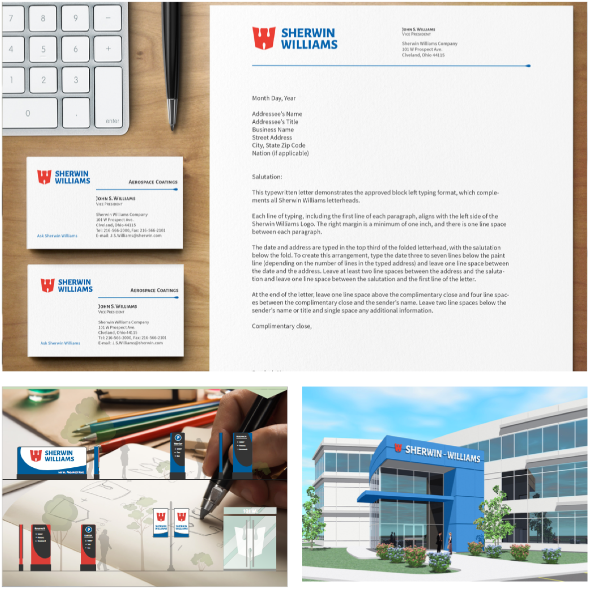
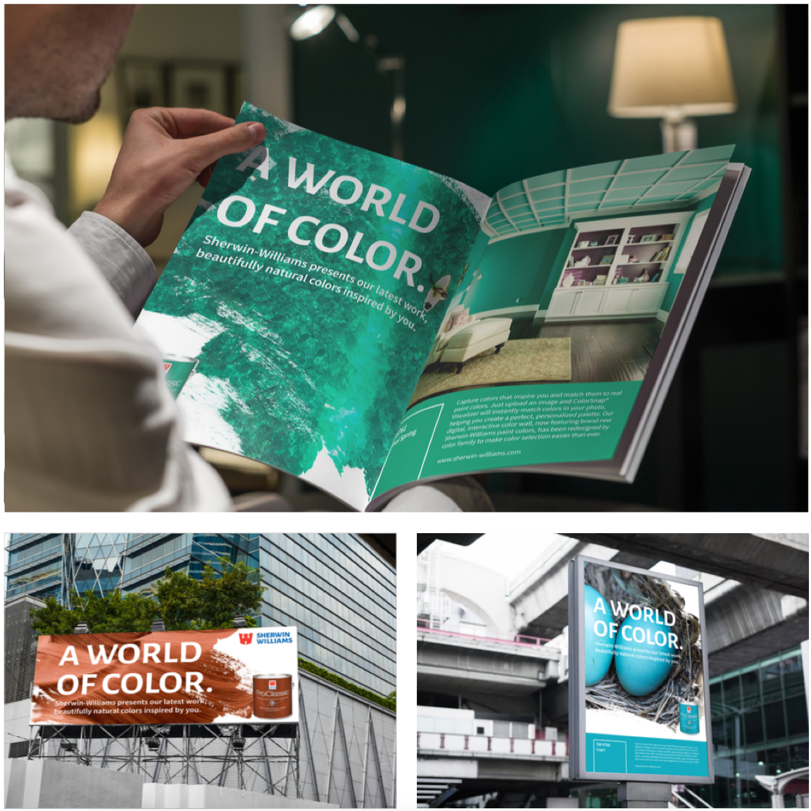
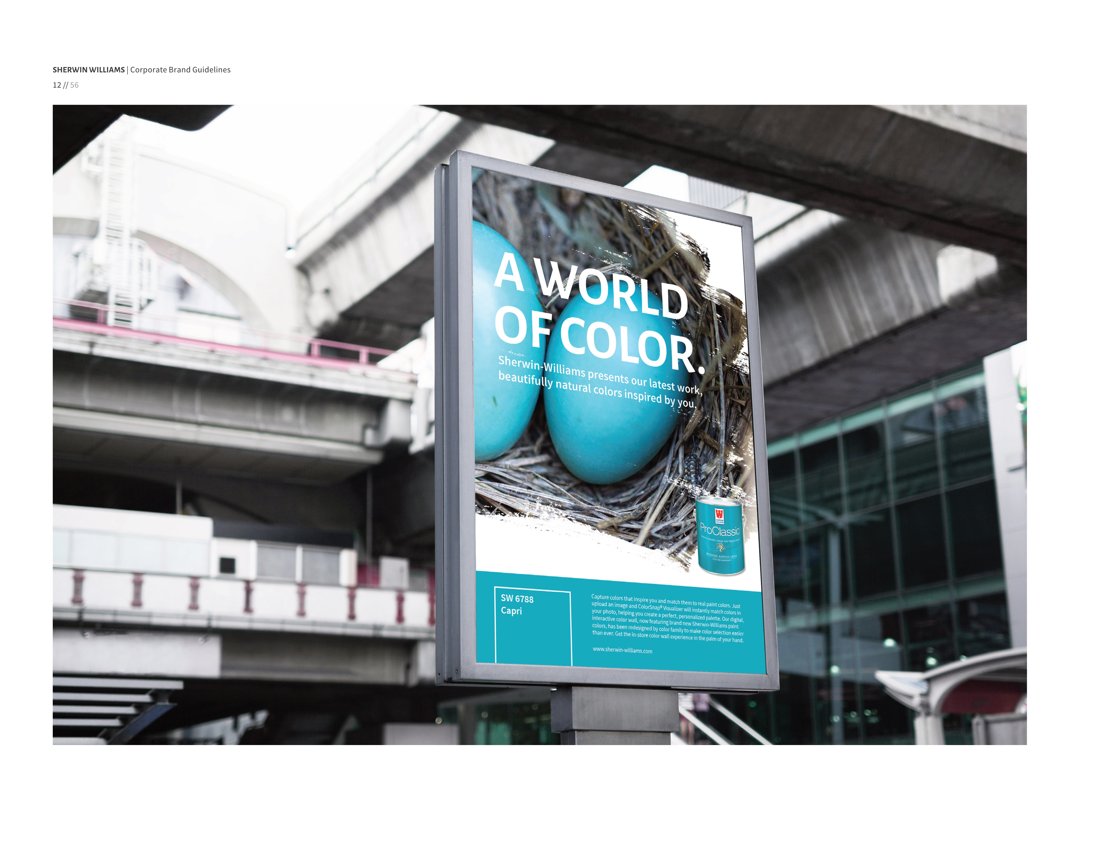
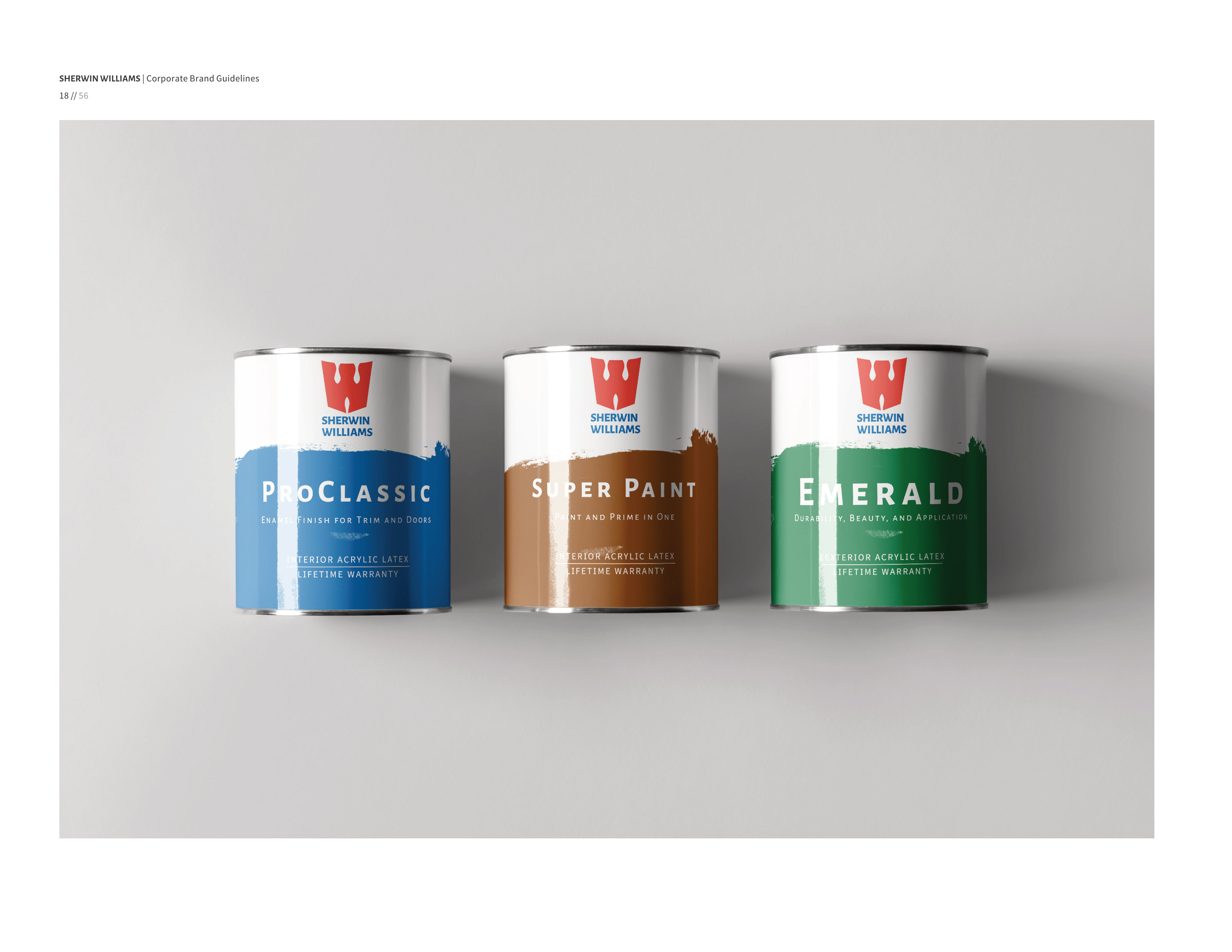
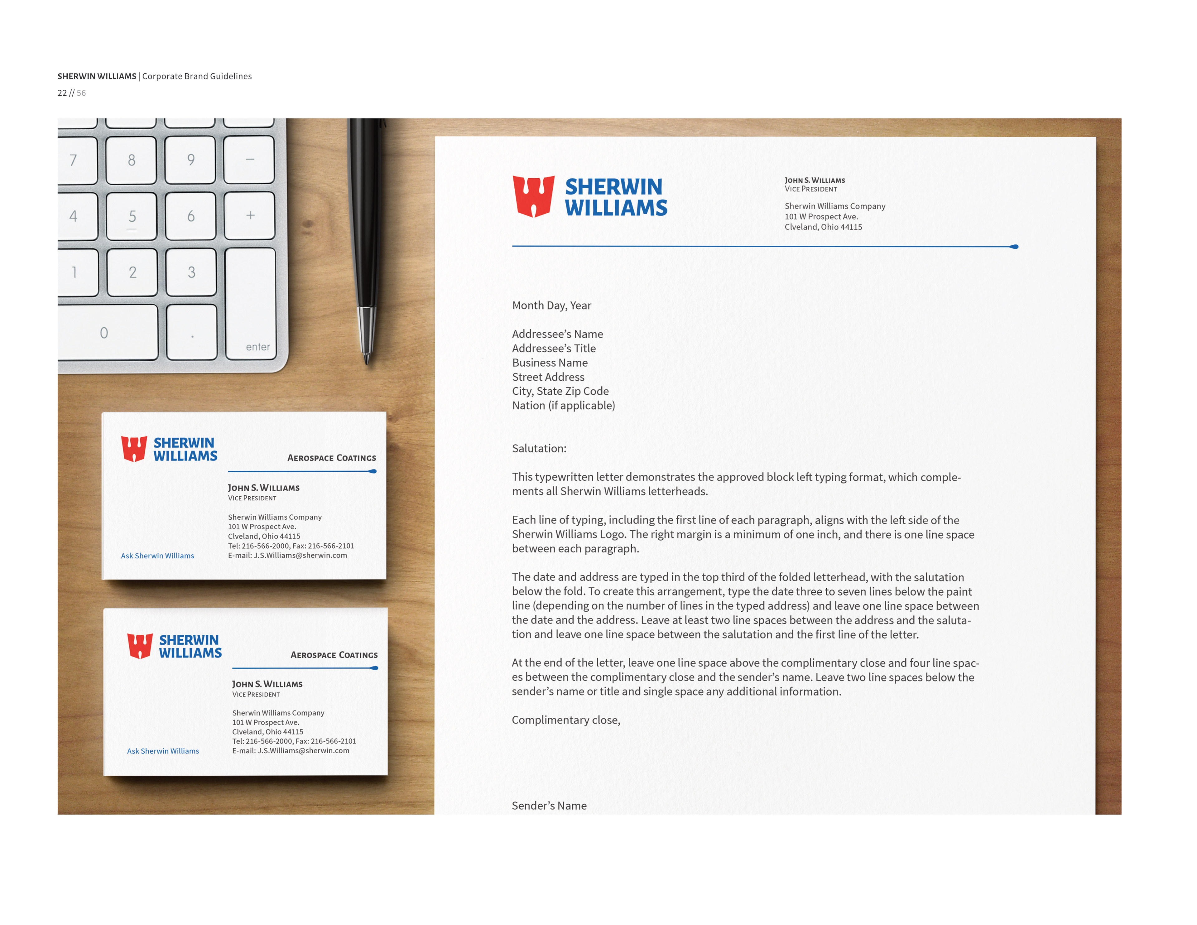
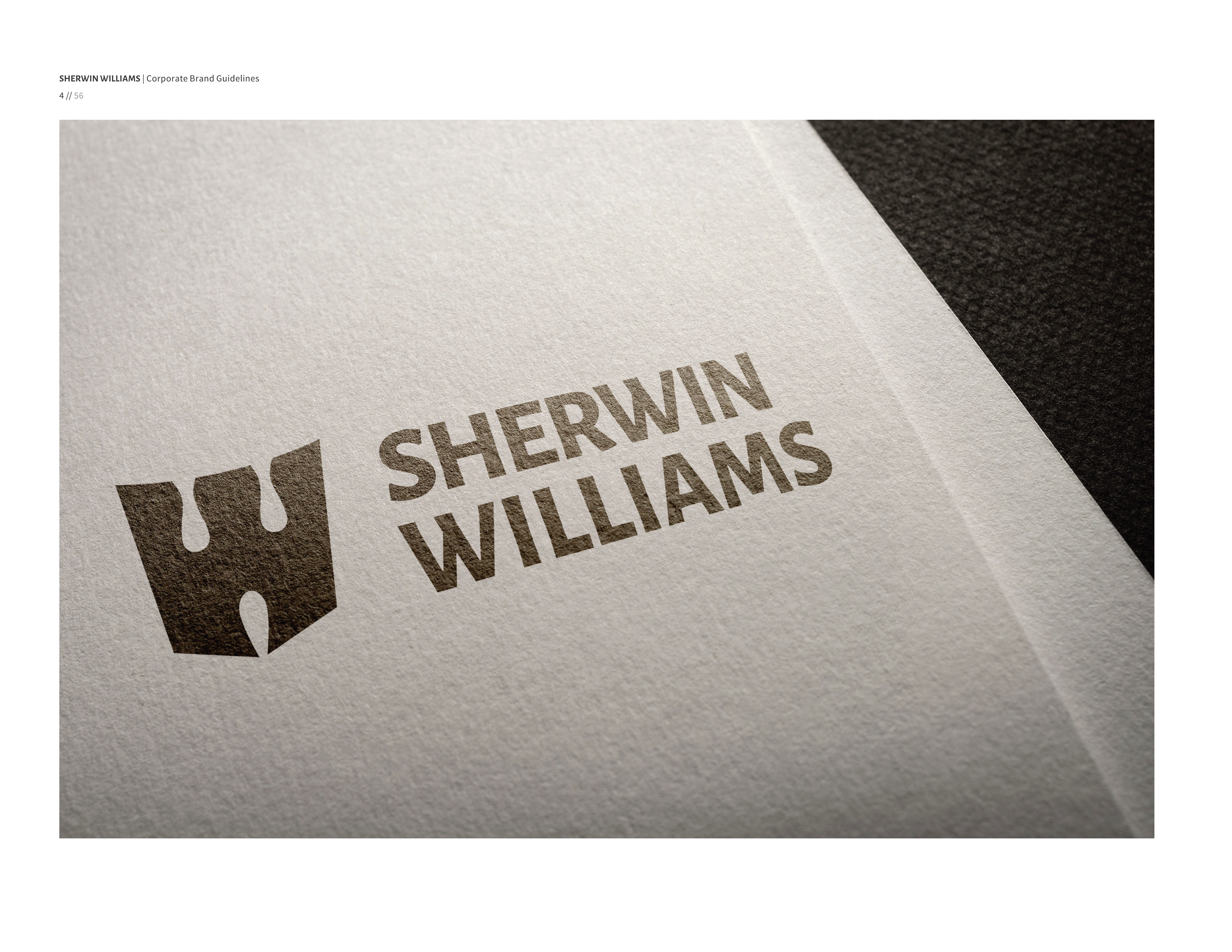
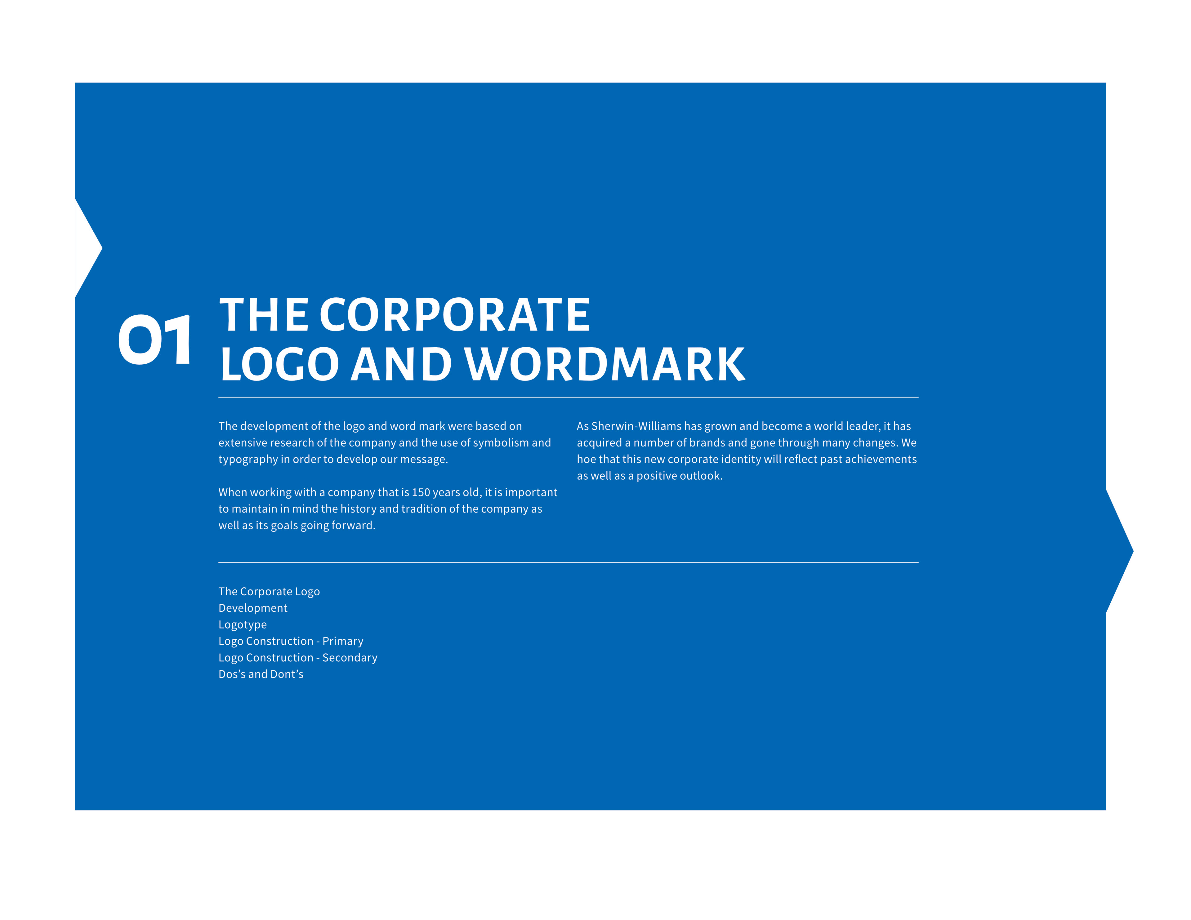
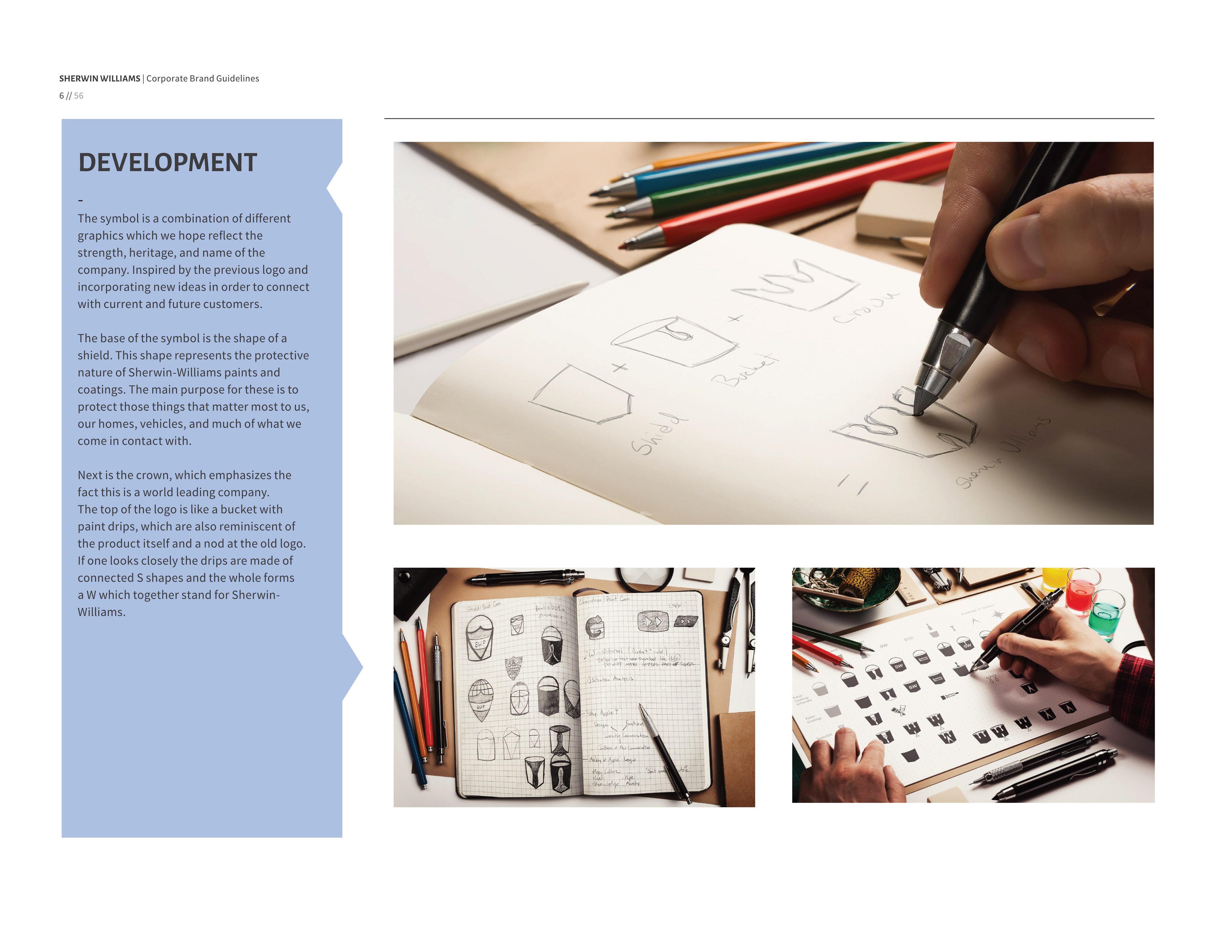
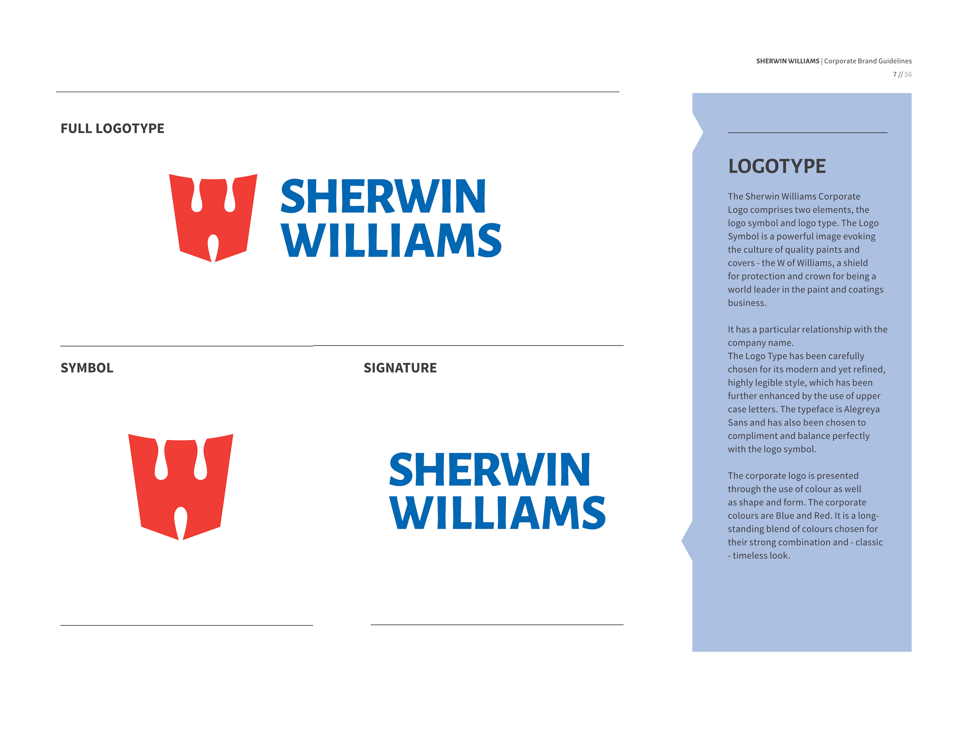
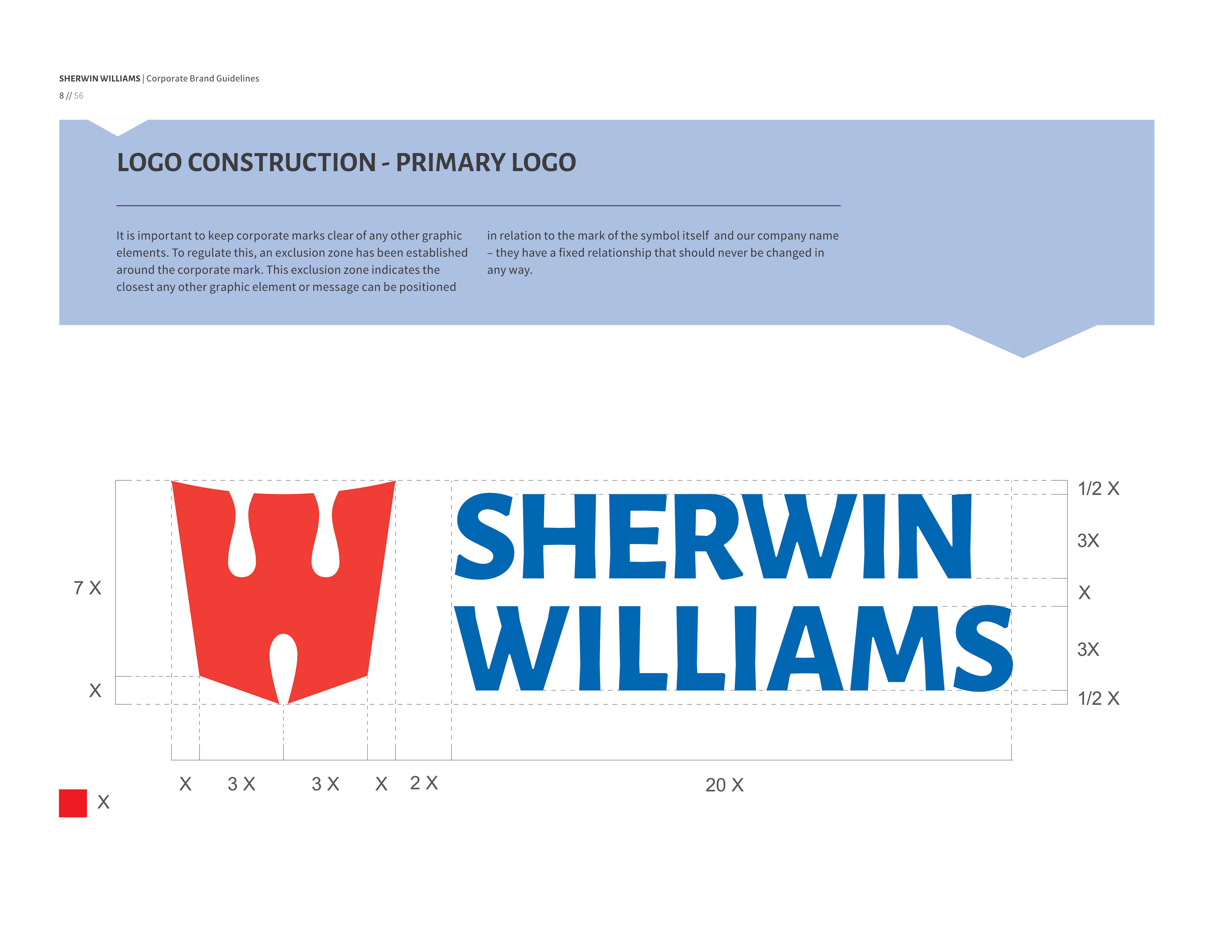
This was a rebranding project for my capstone Design Class. I rebranded Sherwin Williams because I believed their logo was controversial and outdated. The new logo reimagines the pain bucket as a shield and a blend of S and W shapes. Collateral included are stationary, signage, and a new marketing look.
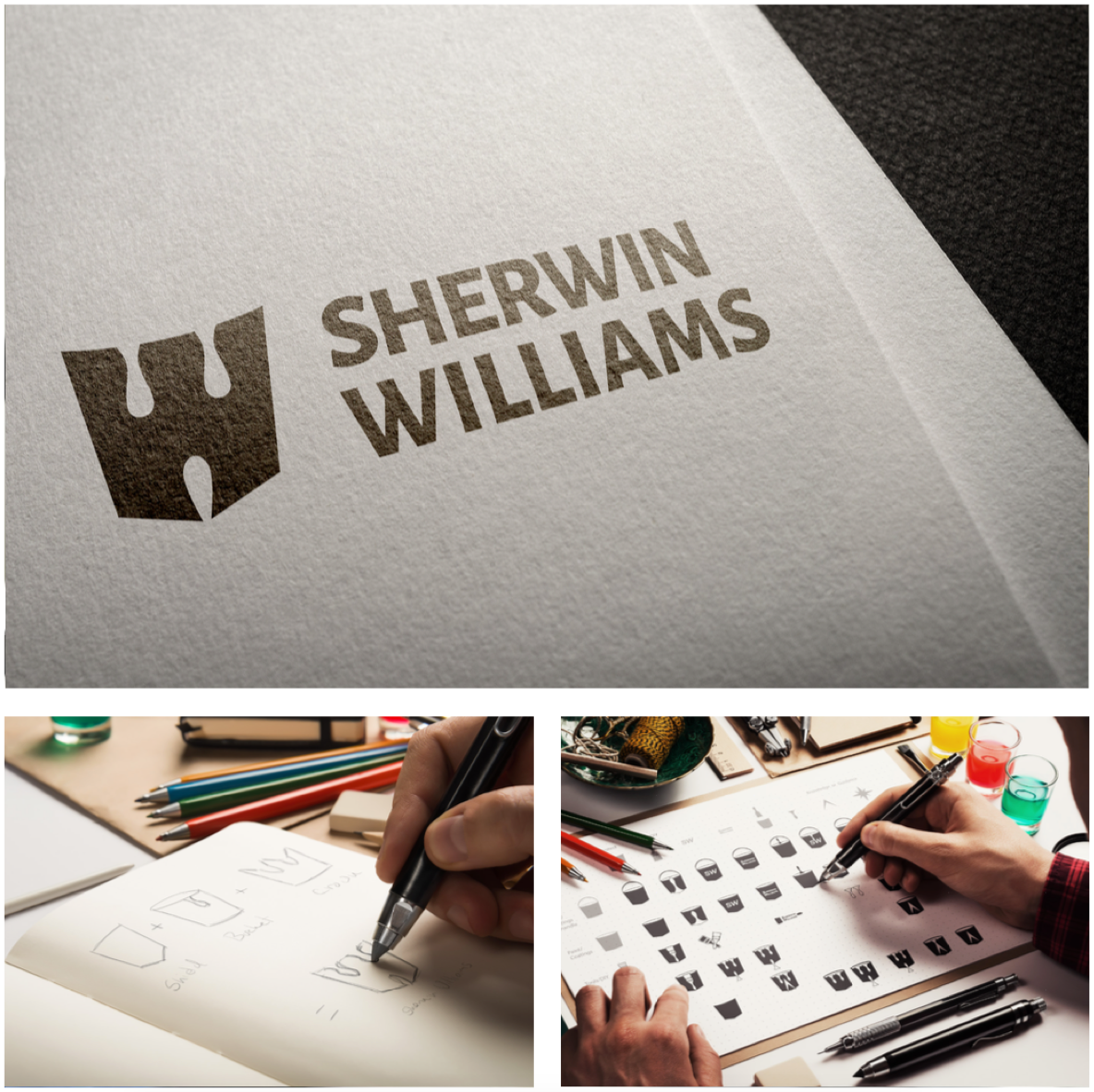
Sherwin Williams logo redesign by Luis Carrillo